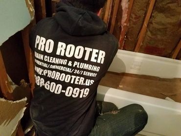
Expert Sewer Contractors at Your Service
We keep your sewer system in top shape all year round.
We keep your sewer system in top shape all year round.

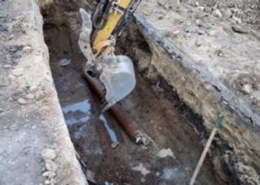
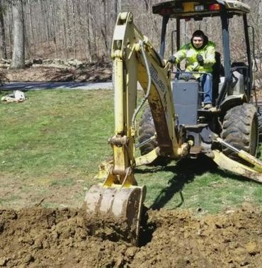
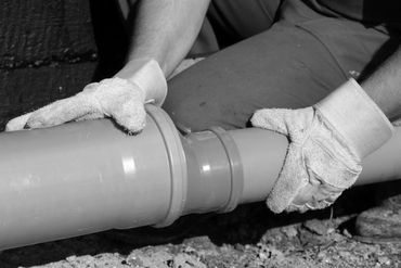
With over 21 years of experience in the sewer industry, we have the knowledge and expertise to handle any sewer-related project, big or small.

24/7 Emergency Drain and Plumbing, We’re Always on the Go!
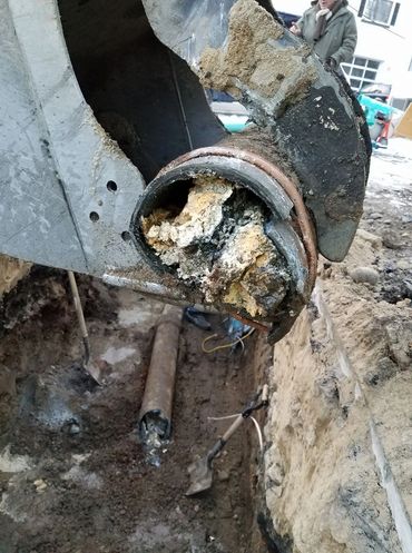


Our powerful hydro jetting equipment can blast away even the toughest clogs in your sewer and drain lines, leaving them clean and clear.
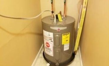
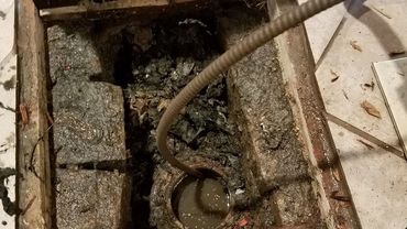
A properly installed sump pump can help prevent flooding and water damage in your home or business. Let us install a new sump pump or repair your existing one.